


.svg)
.webp)
What Is Checkout Optimization?
Checkout optimization is the process of improving the design, functionality, and flow of the checkout experience to reduce friction and make it easier for customers to complete their orders. It focuses on minimizing steps, reducing distractions, and addressing common user concerns.
This can include simplifying form fields, improving page load speed, enabling faster payment methods, and optimizing the layout for mobile devices. It often also involves testing different checkout elements—such as button placements or progress indicators—to see what performs best.
The goal is to reduce cart abandonment by making the checkout process as smooth and intuitive as possible. An optimized checkout helps users feel confident, informed, and in control as they finalize their purchase.

Why Does Checkout Optimization Matter?
Checkout is where revenue is either captured or lost. Any friction at this stage—such as slow load times, unexpected fees, or unclear next steps—can lead to cart abandonment, which directly impacts total sales.
User experience at checkout also affects how shoppers perceive the brand. A confusing or outdated interface can create doubt, while a fast and smooth process builds confidence, even if the rest of the site stays the same.
Mobile behavior adds another layer. As of 2025, over 70% of Shopify traffic comes from mobile devices. This traffic often converts at a lower rate than desktop, largely due to poor mobile checkout experiences like hard-to-tap buttons, long forms, or unreadable layouts.
Customer expectations are also rising. Shoppers are used to fast, intuitive checkout flows from major platforms and expect the same level of efficiency from any store, regardless of size. Delays or unnecessary steps feel out of place.
Checkout optimization aligns user behavior, performance data, and interface design to reduce drop-off at the most critical moment in the purchase journey.
20 Best Practices for Checkout Optimization
1. Allow Guest Checkout
Requiring users to create an account before purchasing introduces friction. Offering guest checkout removes this barrier and allows the order to proceed without delay. Account creation can still be offered after the purchase is complete to encourage future engagement.
2. Offer Multiple Payment Options
Limiting payment methods can exclude potential customers. Providing credit cards, digital wallets (such as Apple Pay or Google Pay), and localized payment options helps accommodate broader user preferences and regions. This increases the chances of a successful transaction.
3. Demonstrate Security and Trust
Clearly displaying SSL certificates, PCI compliance, and recognizable trust badges on the checkout page helps reassure customers that their information is safe. Security indicators in the browser, like HTTPS and a padlock icon, also contribute to trust.
4. Include Mobile-First Design
Checkout flows built with mobile users in mind use larger buttons, optimized form spacing, and responsive layouts. These changes reduce input errors and improve navigation on smaller screens. Mobile-first design is now essential given the volume of mobile traffic.
5. Reduce Form Fields
Every additional form field increases the chance of drop-off. Only essential fields—such as shipping address, payment info, and contact details—are necessary. Optional fields like “Company Name” or “Second Address Line” can be hidden or deprioritized.
6. Display Transparent Shipping & Costs
Unexpected fees at the end of checkout often lead to abandonment. Clearly showing shipping costs, taxes, and any additional fees early in the process helps set the right expectations. If real-time shipping calculations are used, make this clear upfront.
7. Use Progress Indicators
Simple visual indicators, such as step numbers or progress bars, help users understand how far along they are in the checkout process. This reduces uncertainty and encourages them to complete the journey.
8. Incorporate Address Autocomplete
Address autocomplete speeds up form entry and reduces user error. Integrations with tools like Google Places can help fill in address fields accurately with minimal input. This also decreases failed deliveries due to typos.
9. Create a One-Page Flow
Combining all checkout steps on a single page minimizes clicks and page loads. This layout simplifies the process, especially on mobile, and can help users complete their purchase faster without context-switching.
10. Provide Clear CTAs
Call-to-action buttons like “Continue to Payment” or “Complete Purchase” should be visually distinct and use straightforward language. Avoid vague labels such as “Next” or “Submit” that don’t indicate what’s coming next.
11. Capture Exit Intents
When shoppers show signs of leaving the checkout page—such as moving their cursor to close the tab—triggering a light-touch prompt can help recover the sale. This can include a reminder, discount offer, or chat support invitation.
12. Implement Autofill & Smart Form Filling
Autofill features from browsers or mobile OS platforms reduce the time and effort needed to complete forms. Support common formats and field labels to ensure compatibility with Google, Apple, and browser-based autofill systems.
13. Optimize Loading Speed
Slow-loading checkout pages often lead to drop-offs. Compressing images, reducing third-party scripts, and minimizing redirects can improve load times. This is especially critical on mobile networks where latency is higher.
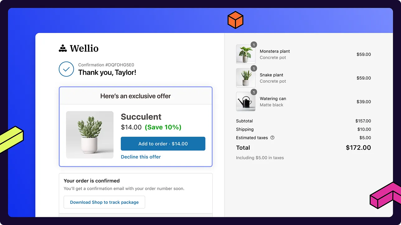
14. Include Visual Reminders of Cart Contents
Displaying a small summary or thumbnail image of cart items throughout the checkout flow helps reinforce purchase intent. This prevents users from navigating away to double-check what they ordered.
15. Enable Save Cart Features
Allowing users to save their cart or return later without losing their selections can prevent lost sales. Persistent carts that carry across devices or sessions are helpful for shoppers who need more time.
16. Incentivize Account Creation Post-Purchase
Instead of interrupting the checkout flow to collect account details, prompt users to create an account after their order is placed. Offering benefits like order tracking or faster reordering can increase sign-up rates.
17. Offer Guest-Friendly Return/Refund Policies
Clear, easily accessible return and refund policies increase buyer confidence. Avoid requiring an account to initiate returns, and clearly state timelines, conditions, and steps to complete the process.
18. Highlight Support Options
Make support resources visible during checkout in case users have last-minute questions. This can include live chat, FAQ links, or a clearly placed phone number. Fast access to help can prevent abandonment.
19. Test & Measure Continuously
Small changes to layout, copy, or order of operations can impact performance. Run A/B tests regularly, monitor drop-off points in analytics, and use heatmaps or session recordings to identify friction.
20. Enhance Post-Purchase Upsells
Once the checkout is complete, offer relevant add-ons or upgrades such as product bundles, expedited shipping, or accessories. These can be shown on the confirmation page or in follow-up emails to increase average order value.
Frequently Asked Questions About Checkout Optimization
How can I reduce cart abandonment on mobile devices?
Use mobile-optimized layouts that prioritize large touch targets, vertical scrolling, and minimal input. Autofill, address autocomplete, and mobile wallet integrations like Apple Pay or Google Pay reduce typing. Avoid full-page reloads between steps and keep loading times under three seconds. Show the total cost early, including shipping and taxes. Make error messages clear and easy to fix without clearing the form.
Should I add buy now, pay later options?
Buy now, pay later (BNPL) options like Shop Pay Installments or Afterpay allow customers to split payments over time. These are most relevant for stores with higher average order values or product categories like apparel, electronics, or home goods. Some payment providers offer built-in BNPL services that can be enabled directly in Shopify Payments. Transaction fees may be higher than standard payments, and not all customers will be eligible.
Do loyalty rewards or points matter at checkout?
Loyalty programs that offer rewards or points can influence repeat buyers, but they have limited impact on first-time conversions. If points are redeemable at checkout, the redemption flow should be simple and visible without requiring a separate login. Complicated reward systems or unclear point values can interrupt the checkout process. Some merchants delay reward application until after the purchase to avoid friction.
Moving Forward to Better Conversions
Checkout optimization is not a one-time fix. It requires consistent monitoring, testing, and iteration across every element of the checkout flow. Seasonal traffic shifts, device usage patterns, and buyer behavior will continue to evolve, and the checkout experience needs to reflect those changes.
Checkout performance is closely tied to how well each component—design, speed, form logic, payment flexibility—works together. Isolating and improving one area without considering the rest can create new friction points or shift drop-off elsewhere in the flow.
Incremental updates made across multiple touchpoints tend to outperform large, infrequent redesigns. Brands that maintain a regular cadence of testing—such as A/B variations on button placement, shipping messaging, or autofill behavior—see more consistent improvements in conversion rates.
Book a demo to explore how Platter can optimize your Shopify storefront. [https://www.platter.com/book-demo]


.svg)

.png)


.svg)


.svg)


%201.png)


.svg)
.svg)