How Breathewave Launched a New Sleep Product With a Simple, Education-Led Storefront
Breathewave launched a new type of nasal dilator into a crowded sleep market, with a product that required education, sizing info, and a subscription model that actually made sense in for shoppers. With no final packaging, limited assets, and a small product catalog, they partnered with Platter to build a storefront that could explain the product, guide first-time shoppers, and set the brand up for long-term subscription revenue.


The problem
A new product that required real education
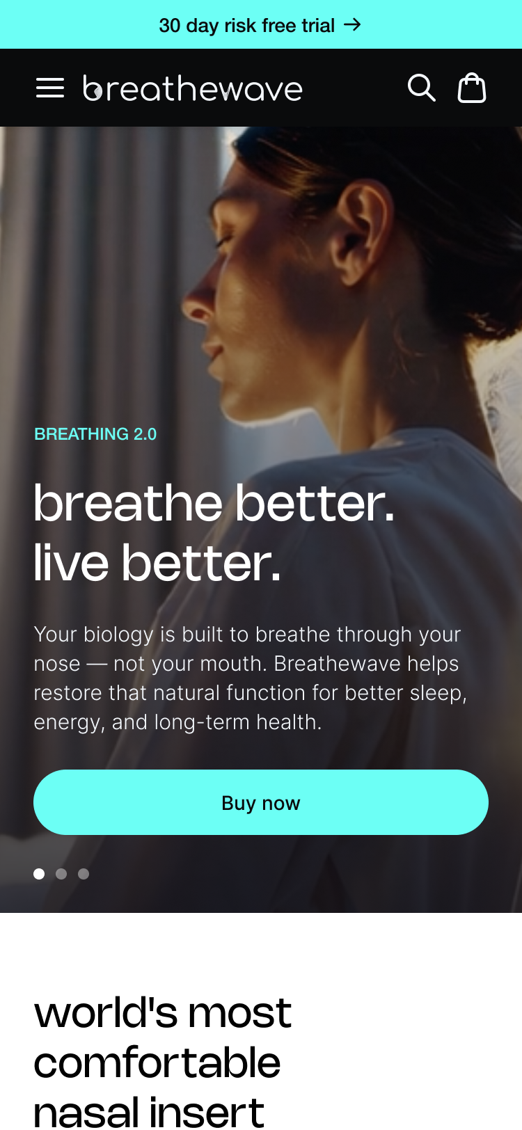
Breathewave’s hero product is a nasal dilator designed to gently open the airways for deeper rest and easier breathing during sleep or sport. Because most shoppers had never used anything like it, the store needed to answer fundamental questions — what the device is, how it feels, how to size it properly, and how it fits into someone’s nightly routine. Without that clarity, customers wouldn’t feel comfortable trying it.
Two steps in the buying journey
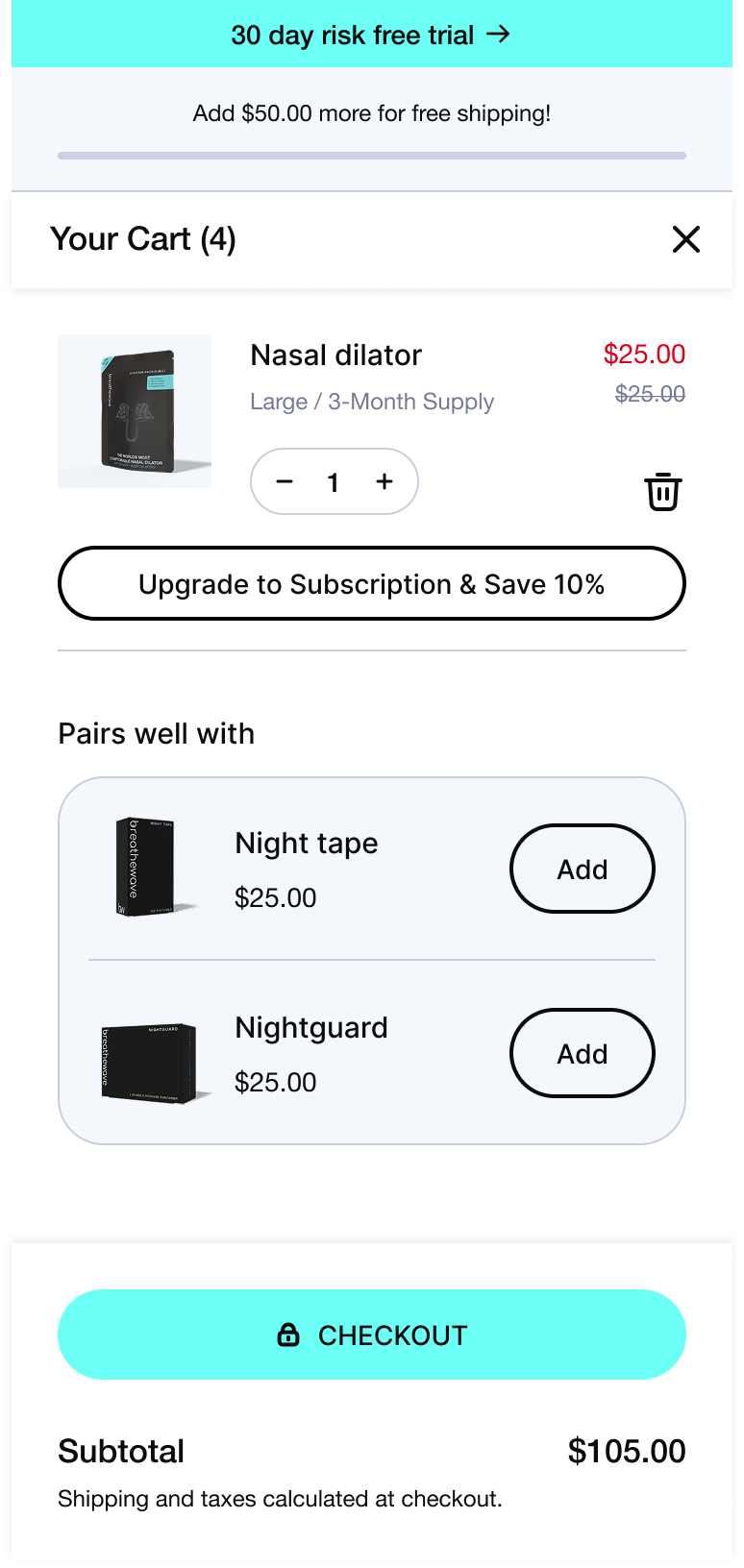
The product also introduced a challenge in how customers move from trying to subscribing. The Starter Pack includes all three sizes so shoppers can test fit, while the refill product is where they subscribe to the one size that works. Subscriptions needed to be encouraged for refills but prevented entirely for Starter Packs. If someone accidentally subscribed to samplers, they’d keep receiving trial packs indefinitely.
Limited brand assets at launch
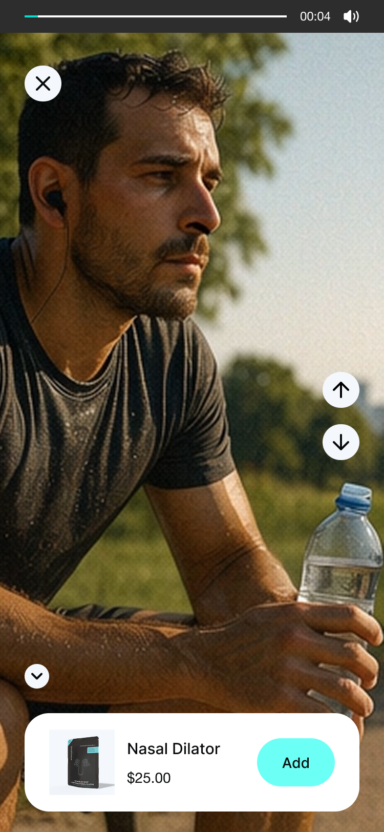
At the start of the project, Breathewave didn’t yet have final packaging, real product photography, or lifestyle visuals. They had an icy blue palette, a few AI-generated assets, and some relatively simple brand guidelines — but the storefront needed to feel calm, credible, and trustworthy right out of the gate.
Post-purchase education was equally important
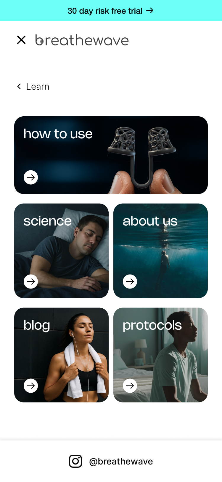
The team also needed a thoughtful post-purchase experience. Because proper usage matters, a simple “How to use” accordion on the PDP wasn’t enough. They wanted deeper protocol-style guidance, cleaning steps, troubleshooting, and best practices — all accessible from QR codes on the packaging so customers could get help the moment they opened their Starter Pack.
Breathewave wasn’t looking for a basic ecommerce build. They needed a store that could educate, size, onboard, and retain customers, not just surface an Add to Cart button.

The solution
An education-led storefront with a guided buyers journey
Platter designed a Shopify storefront around clarity, confidence, and ease of use. The experience explains the product in plain language, guides shoppers through trial to subscription, and answers key questions that prevent customer issues around usage, sizing, or subscription setup.
Turning brand cues into a clean store design
Even with limited assets, Platter created an elevated, cohesive design by focusing on icy blue tones and soft neutrals, which created a clinically clean yet approachable feel. Sand textures and subtle sleep-inspired accents brought warmth to a category that could easily drift into “medical device” territory. Until real photography was ready, Platter's design team help create visuals using AI that kept the storefront feeling premium and intentional.
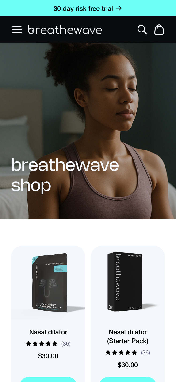
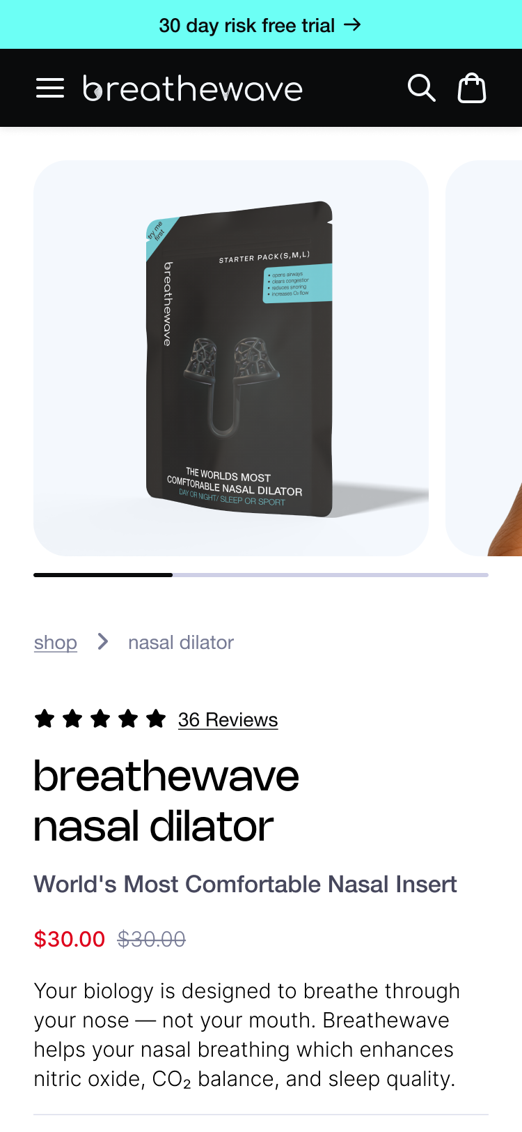
A clear separation between Starter Packs and Refills
Rather than cramming every option into a single PDP, Platter recommended splitting the experience into two pages: one dedicated to the Starter Pack as a one-time purchase for new customers, and another designed specifically for refills with size and supply options. A simple connector module appears on both pages, helping shoppers jump to the correct step — either moving forward to the refill PDP once they’ve found their size or returning to the Starter Pack if they want to re-test or buy another for someone else.
This structure not only prevents confusion but also gives Breathewave clean lifecycle segments for future retention marketing.
Custom subscription logic built around real usage
SKIO powers Breathewave’s subscriptions, but its default configuration allowed unrealistic combinations of supply length and delivery frequency. Platter built a custom subscription component that only shows valid options, locks frequency to supply length, and updates pricing, savings, and cost-per-day messaging in real time. Customers get a simple, predictable interface, while the backend avoids mismatched subscriptions that create unnecessary support tickets.
Unified social proof across multiple SKUs
Since the Starter Pack and refill products live on separate PDPs, Platter configured Yotpo so reviews are grouped and displayed consistently across both pages. No matter where shoppers enter the experience, they see complete, consolidated social proof.
Education pages linked to packaging
To support proper usage, Platter built full instructional landing pages for each product. Each one includes a step-by-step guide, cleaning instructions, FAQs, and troubleshooting tips — structured more like high-traffic landing pages than static content pages. QR codes on packaging now drive directly to the right instructional page, ensuring customers always see the most up-to-date information.
The results
Breathewave launched a storefront that makes a complex, unfamiliar product feel simple and intuitive. The new buying flow guides shoppers naturally from trying all three sizes to subscribing to the one that fits, without confusion or support strain. The custom subscription logic prevents mismatched delivery cycles, the refined design elevates the brand even without final assets, and the instructional hub creates a far better post-purchase experience that supports habit formation. Together, the new storefront helps Breathewave educate faster, build trust earlier, and create a smoother path toward long-term subscription relationships.


The Platter Difference


.svg)


.svg)


%201.png)


.svg)
.svg)